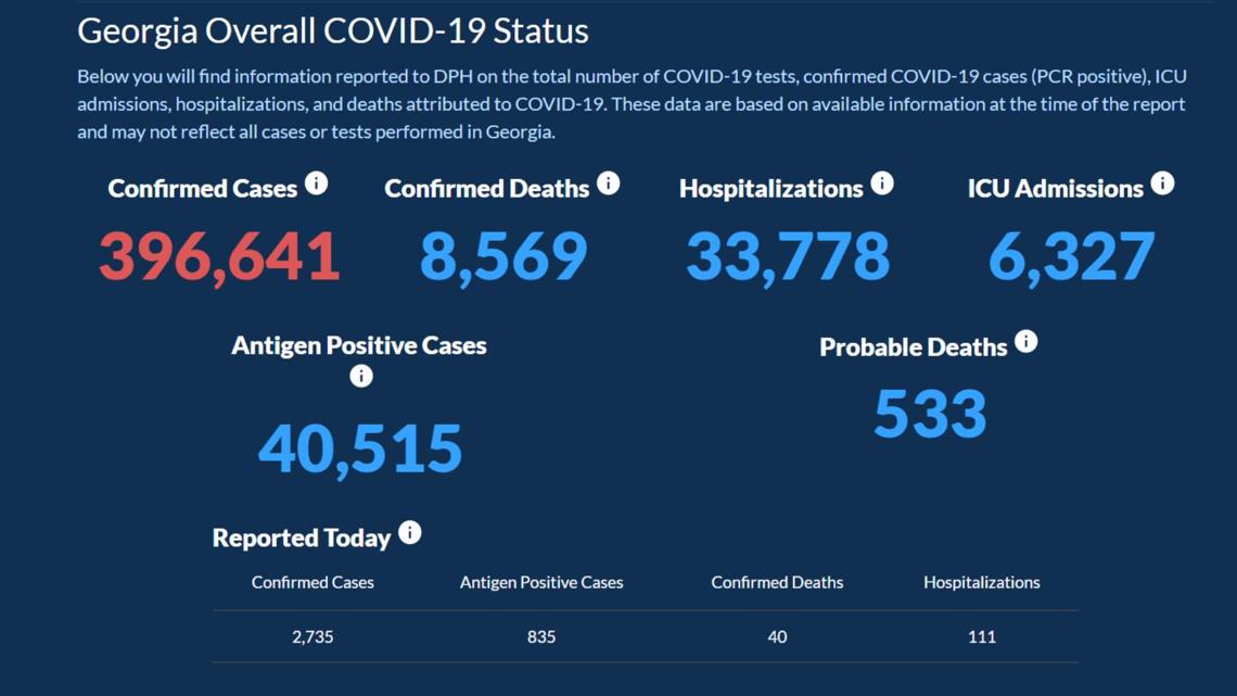
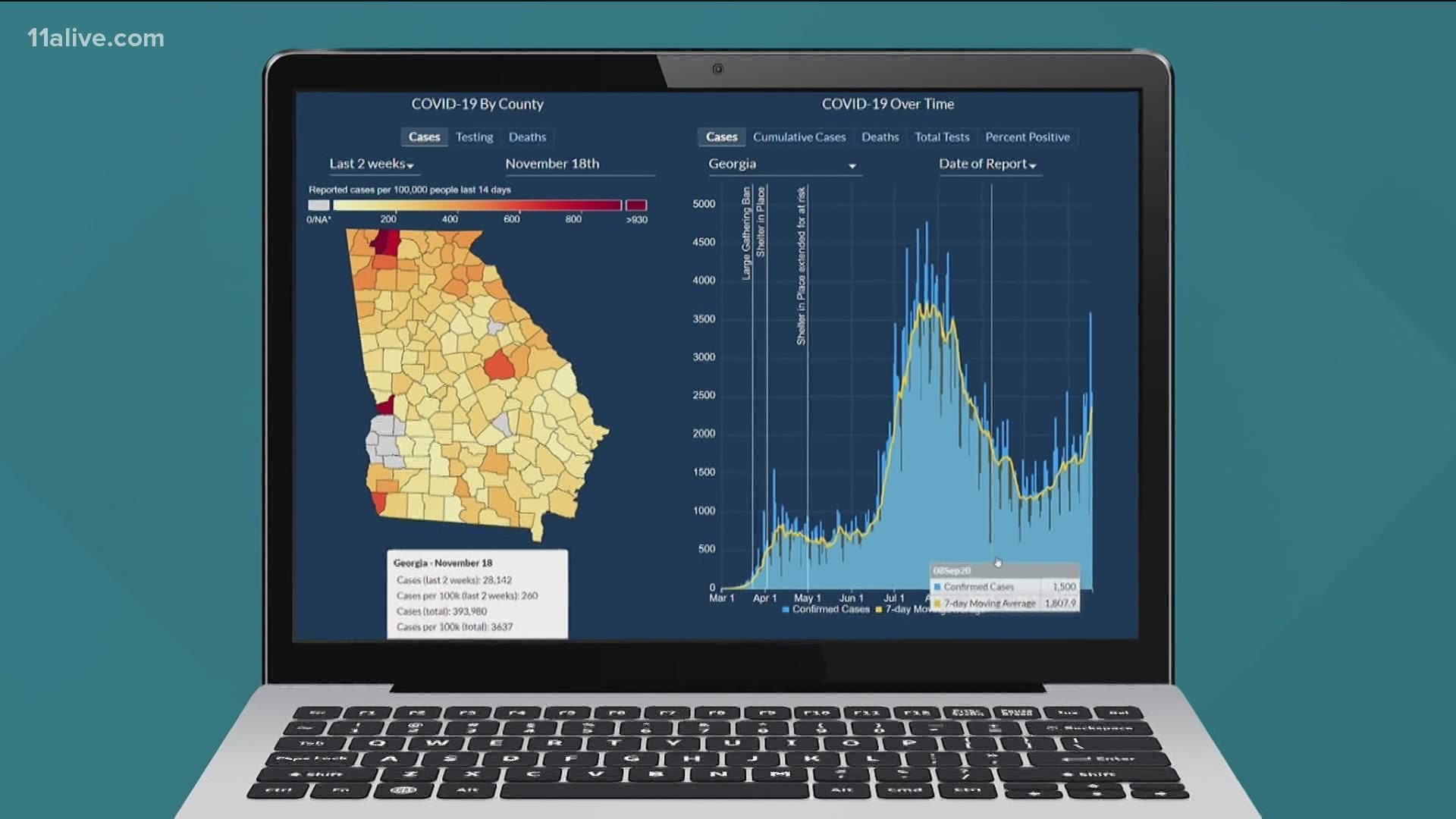
ATLANTA — Just when we were beginning to understand the Georgia Department of Public Health (DPH) COVID-19 data dashboard, the state changed it, creating more questions.
In fairness, the changes are an effort to add even more transparency to the data. But that doesn’t make it any less confusing, especially when you’re trying to compare Georgia’s COVID-19 numbers with other states.
DPH split antigen and PRC test results into separate categories earlier this month on its website, but it’s taken a few weeks for folks to notice the impact.
Once they did, social media lit up with questions about why some websites and even news organizations were reporting higher COVID-19 numbers than the state. The changes also launched a debate among epidemiologists over how these numbers should be used.
Here’s a breakdown of the change and why it matters.
PCR tests are the standard COVID-19 test we’ve been using the past eight months. They use a nose or throat swab, even saliva, to determine if you have the virus. These tests look at viral DNA, so they have to go to a lab and can take a day or more to process. But they are highly accurate.
But as humans, we want answers now. That’s why antigen or rapid tests have become popular. This test hunts for specific proteins to determine if you have COVID-19. Good news, you generally get results in less than an hour. Bad news, they yield a lot of false negatives.
At first, the problem was getting labs to report antigen test results so the state wouldn’t lose sight of the virus' reach in our community. Now that they have the data, the state believes antigen and PCR tests should remain in their own categories.
DPH has even started breaking out deaths, by whether they were confirmed through a PCR or antigen test. Anything using the antigen test is considered probable.


Here’s where debate kicks in.
Remember, antigen tests give off a lot of false-negative test results. That means they say you don’t have COVID-19 – when really you do. But the tests are usually right when a person tests positive. Since the positive cases are what we’re really tracking, some groups like John’s Hopkins argue the data should be put together. If you go to their website, or even the CDC, you’ll find the number of total cases in our state is higher because they’ve added the PCR and Antigen test results in their reporting.
But others – like the state - argue 'probable' is not the same as confirmed. To date, all of the charts and analysis on DPH’s website factor in PCR test results only.
That’s why it’s important to know the source of the data being reported and what categories are being used. It’s another reason why following the trend is usually more helpful than following a specific number. Right now our cases – no matter how you add them up – are rising.
11Alive has a team of journalists crunching the numbers and looking at trend lines to help add the perspective that's needed.

