ATLANTA -- The University of Georgia is taking a bigger step into 2016 as it unveils a new logo.
A website dedicated to the new branding image says the school is embracing the digital shift.
“Today, much of our communications are through digital channels, such as social media and apps, that didn’t exist in 1989 when our previous logo was created, or in 1996 when it was adjusted to accommodate 'recycled papers, email addresses, fax numbers, and other innovations unforeseen in 1989'. Logos used in digital mediums require stronger lines and a bolder design, which have been used in the updated logo," according to UGA.edu
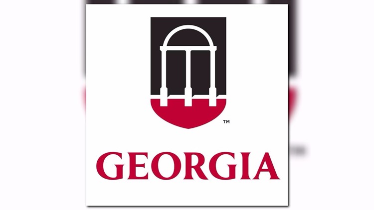
PHOTOS: UGA unveils fresh, new logo


The new symbol has the signature arch, shield and carries “1785,” the school’s founding year. A short video on the announcement shows the signature red and black colors impacting the logo in a live presentation.
The school says UGA’s new logo has been “thoughtfully crafted to present an ambitious face”. There are nearly 260 staff, students, alumni, and faculty that attended listening sessions for the refreshed logo.
In case you’re wondering why the school’s “The” was removed from the logo. The website says the school needed to “take a stand to obtain consistency. We looked at the university’s charter and found that it did not proved a precedent for the capital “T” ---“The.”
You can expect to see more of the updated logo in the coming months on the school’s web, social media, and during football games.