
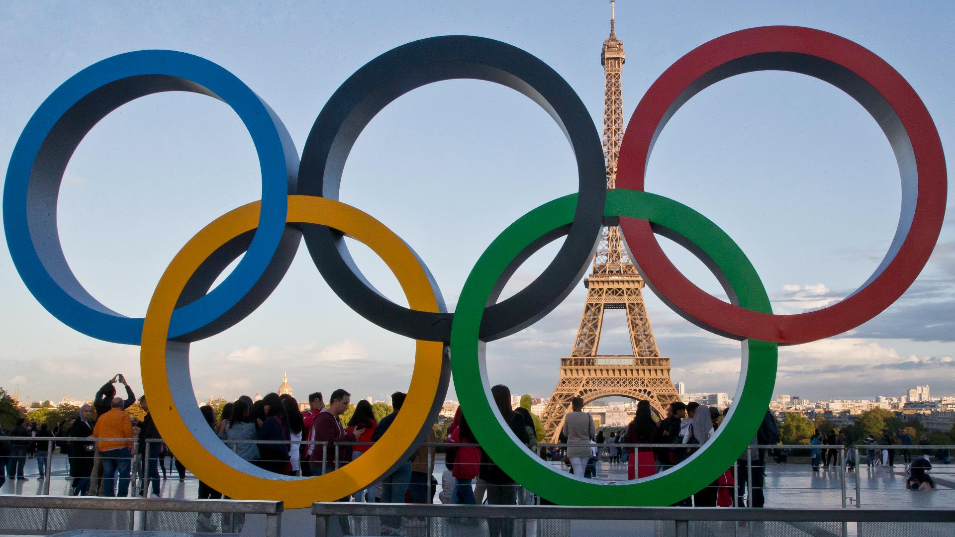
ATLANTA — Editor's Note: The Summer Games are just one month away. The world's best athletes will gather for Paris 2024 , with the Opening Ceremony for the Olympics taking place on July 26. As we prepare for the games, here's a look at the Olympic mascots from the past up until now.
In her own words, here's Allison's take on the mascots.
I am a person with a lot of opinions, especially about things that don't necessarily warrant strong opinions. But then I saw this year's Olympic mascot and was (spoiler) disappointed. So, with the Olympics just weeks away, I thought I'd take a look through the history of Olympic mascots and give my thoughts on each of them. Let me say, my opinions are my own; I speak for only myself and do not mean to offend anybody or any country with my thoughts.
Grenoble 1968: Shuss
I’ll give Shuss credit in that you can tell what he’s doing: skiing. However, this design, especially his face, is a little horrifying. Technically he was a “character,” not a mascot, but he’s listed on the Olympics website so I’m including him.
4/10
Munich 1972: Waldi
I love this. He’s cute and fun-colored. You can tell exactly what he is. But I wish he had the Olympic rings somewhere.
7.5/10
Innsbruck 1976: Schneedmandl (aka Snowman)
Not a very creative name in English, but his original name sounds cool, so points for that. Otherwise, I’m not much of a fan. This looks like a creepy Frosty the Snowman knockoff. Where is his body? And, worse, where is his Olympic tie? There is nothing here to tell me this guy is an Olympic mascot.
3/10
Montreal 1976: Amik
I like the idea here, but the execution leaves something to be desired. The dark coloring and vacant eyes make Amik a beaver I would not want to be in the same water as. But he is identifiable and clearly Olympics-related.
6/10
Lake Placid 1980: Roni
The drawing is definitely more appealing than the stuffed animal version. The simplicity of the shapes and colors make it clear what Roni is. He sticks in your head and is easily recognizable. However, there’s nothing that connects this to the Olympics. Points off for that.
5/10
Moscow 1980: Misha
Incredible. This is an adorable, mischievous little guy. His belt tells you exactly why he’s here. He has a strong presence in local culture. Really not much else to say.
9/10
Sarajevo 1984: Vučko
He’s just cartoonish enough to be fun and creative, but it’s still clear what he is. The design and coloring is simple, making his scarf pop. The Olympic rings are a bit small, but they contrast well with the scarf.
8/10
Los Angeles 1984: Sam
The creativity was sorely lacking here. I might be more understanding if this had been the USA’s first time hosting, but it wasn’t. They went with a basic symbol with a basic name. The costume is fun, but the drawing looks like it’s from a Walmart 4th of July T-shirt. However, I don’t have any serious qualms with the design, and the symbolism behind the eagle is clear.
6.5/10
Calgary 1988: Hidy and Howdy
Our first duo! And what a pair! The names are hilarious and the design is cute. However, you have to really look for the Olympic symbol versus the Canadian flag. If I didn’t know better, I’d just assume these were mascots for Calgary itself.
8/10
Seoul 1988: Hodori
I really like this. His name is cute, he’s not scary and he’s clearly here for the Olympics. This mascot has a good tie to local art and legends.
8/10
Albertville 1992: Magique
I don’t like this. He’s too sharp and angular. The artistry is lacking; his face and the Olympic rings look like they were drawn by a child. The Olympics say he symbolizes dreams and imagination, but I just get nightmare vibes.
4/10
Barcelona 1992: Cobi
Like his name, Cobi is simple and likable. I don't have strong feelings about him in either direction.
6.5/10
Lillehammer 1994: Haakon and Kristin
Another duo! And the first human mascots. Honestly, this idea feels kind of boring; we can see humans any time. Also, the drawings are unsettling; the eyes are staring into my soul.
5/10
Atlanta 1996: Izzy
I might get some flack for what I’m about to say, being a metro Atlanta native and all, but I have nothing kind to say about this mascot. The fact that the original name was “Whatizit” should tell you all you need to know. And it’s accurate, because what is it? According to the Olympics website, he’s not an animal, human or object. In my opinion, he’s an abomination. I like that he has the torch, but I wish the Olympic rings were somewhere too.
2/10
Nagano 1998: Sukki, Nokki, Lekki and Tsukki (the Snowlets)
While you can kind of tell from the drawings that these are owls, they also somehow manage to look nothing like owls. The Snowlets look like they were drawn by young children, but, from my research, they weren’t. The colors are fun and they are goofy looking, but the Olympic rings are small and hard to see.
4/10
Sydney 2000: Syd, Ollie and Millie
I like that these names are cute and creative; they represent Sydney, Olympics and the new millennium. However, the drawings are a bit unsettling in the way they are anthropomorphized. They gain points for a clear tie to the host country, but lose them immediately for no clear Olympic tie.
4/10
Salt Lake City 2002: Powder, Coal and Copper
Absolutely adorable. Both the drawings and the stuffed versions of these mascots are fun and easy on the eyes. This is the energy we need. The ties to local weather and resources are fun. But once again, the Olympic symbolism is missing.
7.5/10
Athens 2004: Phevos and Athena
Once again, this duo looks kind of like they were drawn by children. However, something about it is quite endearing in this case. There is a lot they could have dug into with the games going back to Athens, so I like that this design is actually based on a doll dating back to Ancient Greece. However, this design isn’t something the average person would recognize.
7/10
Turin 2006: Neve and Gliz
These look like emoji faces with bodies. But my bigger criticism is that it’s not really obvious what they are. I wouldn’t look at these and think, “Ah yes, a snowball and an ice cube.” Nothing here screams “Italy” either.
4/10
Beijing 2008: Beibei, Jingjing, Huanhuan, Yingying and Nini (the Fuwa)
YES. These are cute, fun and creative. I love that they’re a quintet. Also, their names form the sentence “Welcome to Beijing,” which is a brilliant Easter egg. Furthermore, there is a lot of symbolism with the group as a whole and each individual character; I love seeing the thought put into these.
9/10
Vancouver 2010: Quatchi and Miga
Phenomenal. I have no critiques. The ties to local lore are great. The design is precious. Canada killed it with this one.
10/10
London 2012: Wenlock
What in the world is this? My first guess was some kind of alien, and the actual explanation is, I would argue, stranger. That being said, he is fun and goofy looking, and certainly memorable. But I don’t know if he was the best choice for an Olympic mascot.
6/10
Sochi 2014: The Hare, the Polar Bear and the Leopard
Massive points off for the lack of naming creativity. I will say, this trio is cute. But once again, I have to look really hard to see the Olympic symbols. If I didn’t know better, these just look like regular cartoon characters. The symbolism of three mascots for three places on the podium is a nice Easter egg, but there is no visual obvious Olympic tie.
5/10
Rio 2016: Vinicius
I like this guy; he’s fun and colorful. He’s supposed to be a mix of things, but he also looks like he could be an anthropomorphized cat or monkey. Either way, looking at him doesn’t creep me out, so points for that.
7/10
PyeongChang 2018: Soohorang
Amazing. What a dude. You can tell what he is, you can tell he’s here for the Olympics and he’s absolutely adorable. This is the prototype!
10/10
Tokyo 2020: Miraitowa
This mascot is not as disappointing as 2020 was, but it is a bit underwhelming. Once again I ask: what is this? An alien? Miraitowa is cute, sure, but what’s up with the checkered pattern? At least the Olympic tie is visible with this mascot.
5/10
Beijing 2022: Bing Dwen Dwen
This here is a cute mascot with a great local tie-in and an attractive design. The ice-made astronaut suit is a bit of an odd choice though. The Olympic rings could have been given a bit more space on Bing Dwen Dwen’s wide torso.
7/10
Paris 2024: Phryges
Last, and nearly least, we come to this year’s mascot. In short: I do not like it. It looks weird, and the choice to go for a hat of all things is questionable. I respect the historical ties, but I think better choices - i.e. not clothes - could have been made. If I didn’t know what this was, I’d assume it was a deformed starfish or something. But, the coloring matches France’s flag and the Olympic rings are visible, so there’s that.
4/10