For an event that was born before the advent of digital design, the AJC Peachtree Road Race logo has not changed much over the course of the race’s 49-year history. Just like the race course, there has been one just one major turn in the logo’s design in the first 49 years of the event. Now, ahead of next year’s Peachtree, Atlanta Track Club unveiled a new logo for the 50th running of the race. Before we peel back the curtain on the history, reasoning and process of creating the logo for the 50th, let’s take a brief look at Peachtree logos past.
The Original
As with so many things related to the Peachtree, much of the story of the logo comes back to the T-shirt. The first Peachtree was logo-less, a collection runners breaking in the streets of Atlanta without a unifying symbol. But when Tim Singleton, founder of the Peachtree, ventured north for the 1971 Boston Marathon, he got an idea.
“When we picked up our race packets they included a rather simple yellow T-shirt with ‘BAA Boston Marathon’ printed on the front,” he said before the 35th Peachtree. “I thought this was a really neat idea, and was there some way to incorporate this concept with Peachtree?”
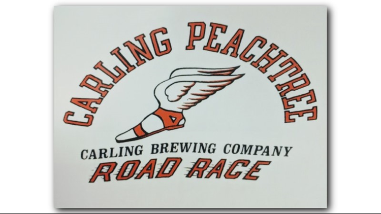
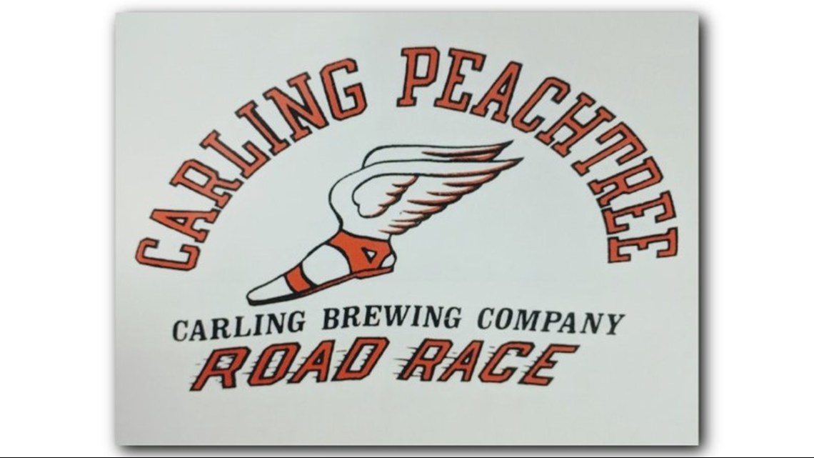
The winged foot of Hermes had been a frequent symbol for Atlanta Track Club up to that point, including as the moniker for Wingfoot magazine, which started in the Club’s first year in 1965. Until 1978, it also served as the logo for the Peachtree, as sponsorship changed from Carling to Tuborg and then to the Atlanta Journal and the Atlanta Constitution.
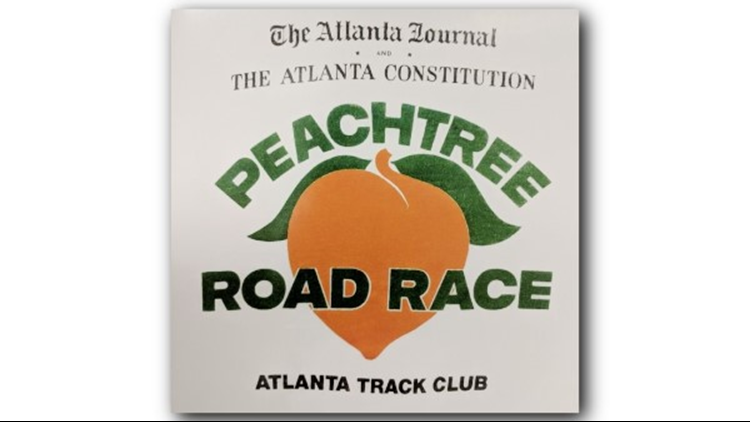
The Peach Appears
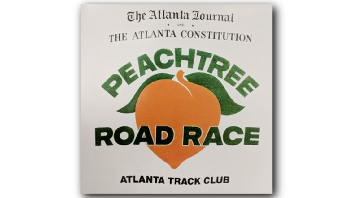
In 1978, in conjunction with a new finisher’s T-shirt, the peach first appeared in the logo of the Peachtree. With two leaves flowing out over the top, this first example of the Club leaning into the name of the race was used, essentially unchanged, for many years to come. That peach was a mainstay, even as sponsors and T-shirt designs changed and the race continued to grow.
The 25th
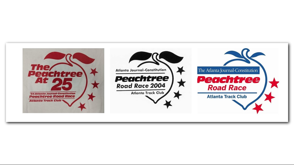
The big change for the unveiling of the 25th logo was the addition four stars circling the badge, along with a design emphasizing the 25th running of the race, which was built off the design from the 20th. This logo remained in place, largely unchanged other than the addition of the AJC and some color (and the subtraction of a star), until 2014. Below you’ll see a few iterations of that logo over the years.
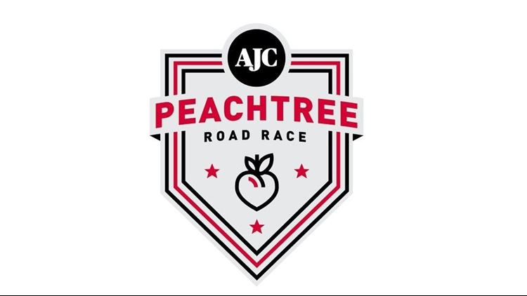
The Badge
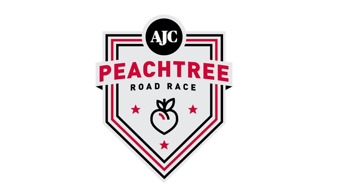
Before Atlanta Track Club launched its current branding in 2014, there was a lack of cohesion among the logos for each race. A badge system was implemented with the goal of providing a unifying look, while paying homage to the personality and history of each race.
Central to that was the badge for the Peachtree, the Club’s most iconic race. While straddling the line between new and old, buttoned up and personable, the Club incorporated elements from previous logos, including the peach and the stars, into the new badge.
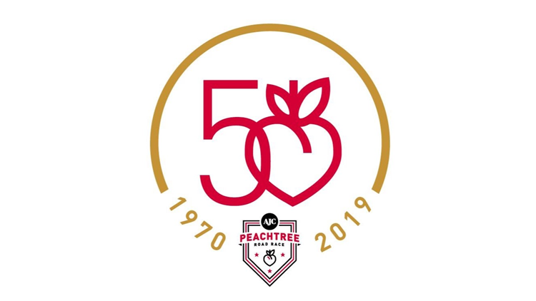
The 50th
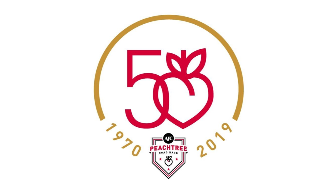
Ahead of the 50th AJC Peachtree Road Race, there was a clear understanding within Atlanta Track Club of the need to have a striking visual image for the milestone running. As far back as April, the 50th Peachtree Committee was working on ideas. They voiced a number of goals to the Club’s Senior Brand & Design Manager Leigh Moyer, who spent the latter half of the spring drawing on inspiration from Super Bowl logos and other championship graphics before submitting five designs to the committee.
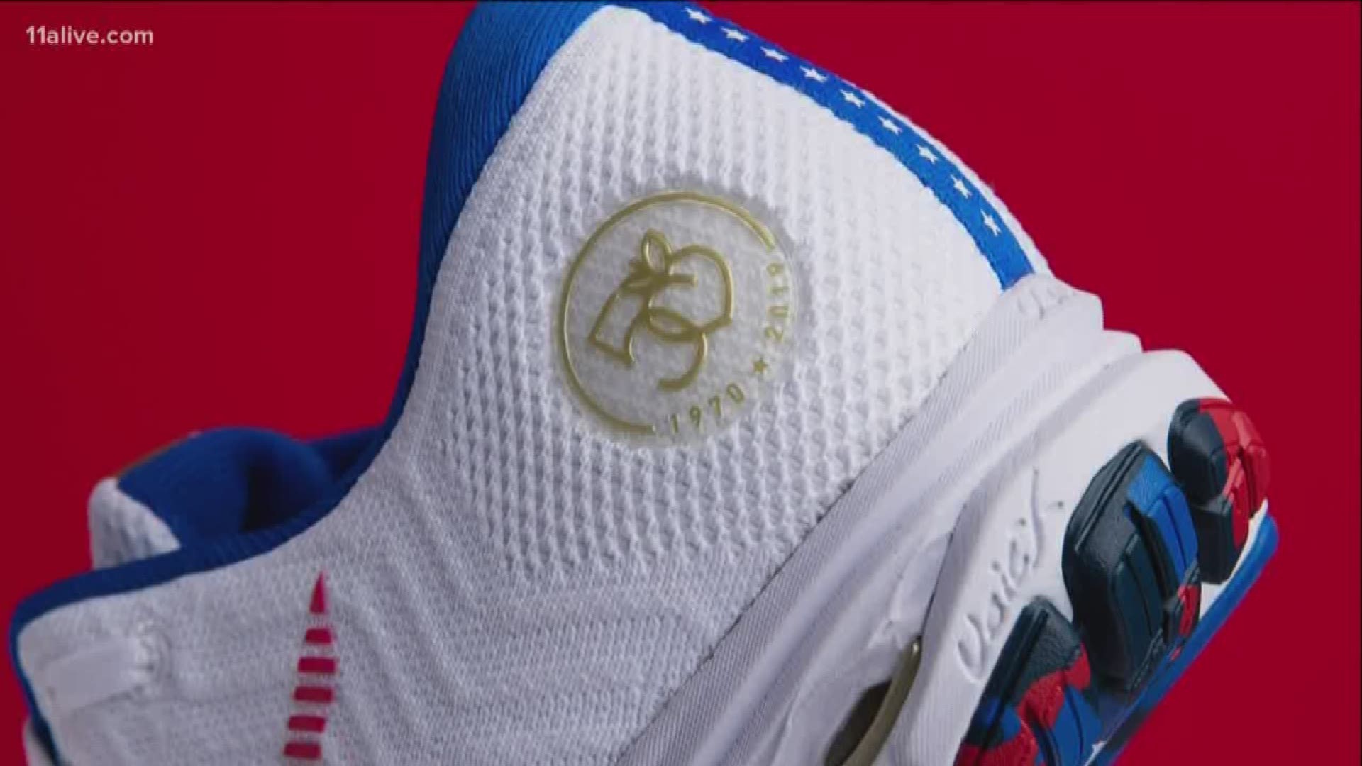
After many rounds of feedback, a final version was chosen. Just as the history of the stars and peach was incorporated into the logo, there was a major emphasis on keeping the Peachtree badge within the logo as a nod toward the race’s ongoing legacy. Keen eyes will notice the peach in the “0” is lifted directly from the badge, as part of an effort to create harmony between this year’s event and future Peachtrees.
Circling the badge and the 50 is the most striking aspect of the logo, the gold ring, which Moyer used with the goal of “eliciting a unique, one-of-a-kind feeling about the race and the prestige of the 50th.” And because the Club has historically celebrated the celebratory running of the race, rather than a celebratory anniversary, the year of the first running and next year’s edition are included.